When you think of web design, your first thoughts are often of color and placement: making things look good as you move around a website. And while those things are important, they’re certainly not all that goes into creating a good marketing website design. Even professional web designers often get caught up in thinking that it is.
So let's take a look at five web design best practices that will help your site not only look good, but do as well for you.
1. Understand Your Target Audiences
Before mapping out your website's pages, navigation, copy, design, anything -- take a step back and think about your audience: who really is on the other side of the screen?
Think about what makes all the members of your target audiences similar, and what makes them different? Separate them out into a few core groups, then develop your site to speak to each of these groups on their own terms, and in their own unique way.
A simple example may be a management consulting firm that specializes in helping doctors, lawyers and accountants run their practices efficiently. While many of the goals these three core audience groups are after are the same (cost savings, efficiency, best practices), they are going to be approaching these issues very differently.
The consulting firm's web design needs to take this into account and speak differently to those groups.
2. Determine Use Cases
Directly related to audience segmentation is the defining of use cases for these core audiences. Consider: why are these people using your website? How are they accessing it? Via mobile devices, at work, at home? What kind of lifestyle do they have? What do they aspire to?
By determining what your audience wants to get from your website, and how they want to get it, you can design the site to provide it for them in an appealing and efficient way.
3. Plan Content Strategy and Hierarchy
Based on what you've already determined about your audiences and what they want from your website, you can design the site's navigation and content to speak directly to those people in clear, intuitive ways.
Skip the jargon and go for the heart of the matter instead. Make sure the most important thing your audience wants to know is front and center, impossible to miss. And make sure anything your audience couldn't care less about is completely removed. For example, you may want to remove company press releases in favor of benefits of your product or service.
For more information on planning your website, see our article on what we've learned from planning large websites.
4. Consider the Lead Funnel
If your site is designed to generate leads and/or sales, the content strategy and navigation should directly affect how various pages are designed and linked.
Which pages are at the top of your funnel (i.e. bringing in organic search or paid search traffic), and which pages make the sale? How much information do you need from a lead in order to follow up effectively, and what is your plan for following up?
In all cases, streamline the pages and the funnel to ease the user's trip from interested prospect to engaged buyer.
5. Good Graphic Design
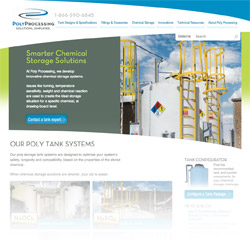
 Good, strategic design can assist lead generation efforts, like it did for Poly Processing.
It had to be in here somewhere, right? Making everything look good and is "on brand" is still important. But, not at the expense of any of the other four web design best practices we've discussed. Having a well-designed website can improve a prospect's image of a company.
Just ask our client Poly Processing, whose website redesign reinforced their brand messaging and offline communication, and increased their web leads by 5x. Additionally, their sales staff has confidence in the website to attract new customers and make the sale.
Clean, functional usability is the goal, not fancy aesthetics. A website redesign is not an art project.


